NextUp '25
NextUp '25
NextUp '25
project type
Event Branding & Marketing Campaign
my role
Lead Marketing Designer
project overview
NextUp is an annual conference at the intersection of tech and youth sports, bringing people from around the country to New York City to share best practices and shape the future of the industry.
challenge
When it came time for another year of NextUp, the brand needed a refresh while staying recognizable to returning attendees. The existing identity had built equity but had become visually busy and inconsistent across digital and in-person touchpoints. At the same time, the event needed to balance two audiences: the energy of youth sports and the clarity expected from a tech conference. The challenge was creating a simpler, more cohesive system that could scale across web, social, and the venue experience.
When it came time for another year of NextUp, the brand needed a refresh while staying recognizable to returning attendees. The existing identity had built equity but had become visually busy and inconsistent across digital and in-person touchpoints. At the same time, the event needed to balance two audiences: the energy of youth sports and the clarity expected from a tech conference. The challenge was creating a simpler, more cohesive system that could scale across web, social, and the venue experience.
When it came time for another year of NextUp, the brand needed a refresh while staying recognizable to returning attendees. The existing identity had built equity but had become visually busy and inconsistent across digital and in-person touchpoints. At the same time, the event needed to balance two audiences: the energy of youth sports and the clarity expected from a tech conference. The challenge was creating a simpler, more cohesive system that could scale across web, social, and the venue experience.
solution
As lead marketing designer on this project, I started by auditing the previous year’s branding to identify what to preserve and where the system could be simplified, then used those insights to shape a more focused visual direction. I leaned into bold color and key symbols from the logo to anchor the system, then introduced a new type direction to improve hierarchy and legibility across web and event signage. This refreshed the identity without losing recognizability and made key messages easier to scan and deploy consistently across channels. Working closely with the creative director and events team, I iterated across Illustrator and Figma with fast feedback loops to refine the system and ensure consistency across web, social, and on-site applications.
As lead marketing designer on this project, I started by auditing the previous year’s branding to identify what to preserve and where the system could be simplified, then used those insights to shape a more focused visual direction. I leaned into bold color and key symbols from the logo to anchor the system, then introduced a new type direction to improve hierarchy and legibility across web and event signage. This refreshed the identity without losing recognizability and made key messages easier to scan and deploy consistently across channels. Working closely with the creative director and events team, I iterated across Illustrator and Figma with fast feedback loops to refine the system and ensure consistency across web, social, and on-site applications.
As lead marketing designer on this project, I started by auditing the previous year’s branding to identify what to preserve and where the system could be simplified, then used those insights to shape a more focused visual direction. I leaned into bold color and key symbols from the logo to anchor the system, then introduced a new type direction to improve hierarchy and legibility across web and event signage. This refreshed the identity without losing recognizability and made key messages easier to scan and deploy consistently across channels. Working closely with the creative director and events team, I iterated across Illustrator and Figma with fast feedback loops to refine the system and ensure consistency across web, social, and on-site applications.

Messy exploration (the part many designers don’t show) to pressure-test what to keep, what to simplify, and how the 2025 identity could evolve.
Messy exploration (the part many designers don’t show) to pressure-test what to keep, what to simplify, and how the 2025 identity could evolve.

Final logo colorways were built to work across digital and on-site applications, ensuring strong contrast, legibility, and consistency across different environments and backgrounds.
Final logo colorways were built to work across digital and on-site applications, ensuring strong contrast, legibility, and consistency across different environments and backgrounds.
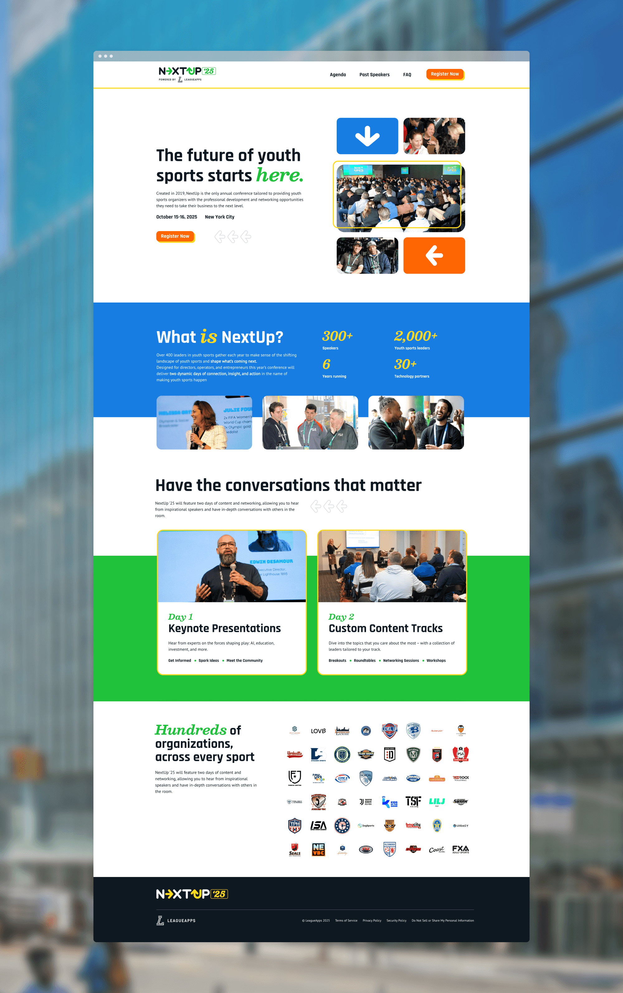
The website was designed to clearly communicate the event’s value, schedule, and speakers while aligning with the refreshed brand system. Layouts prioritized clarity and conversion, making it easy for visitors to understand the event and take action.
The website was designed to clearly communicate the event’s value, schedule, and speakers while aligning with the refreshed brand system. Layouts prioritized clarity and conversion, making it easy for visitors to understand the event and take action.
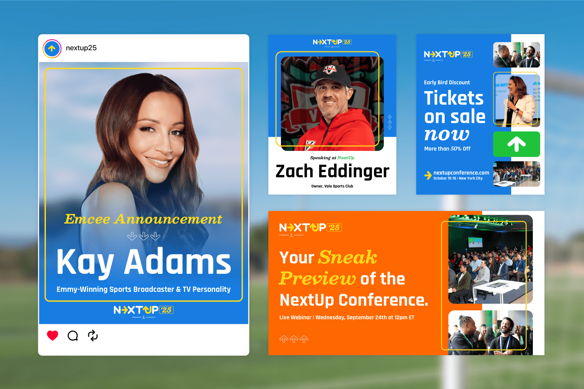
A variety of social assets designed to drive interest across Instagram and LinkedIn by leveraging speakers, ticket discounts, and a sneak-peek webinar.
A variety of social assets designed to drive interest across Instagram and LinkedIn by leveraging speakers, ticket discounts, and a sneak-peek webinar.

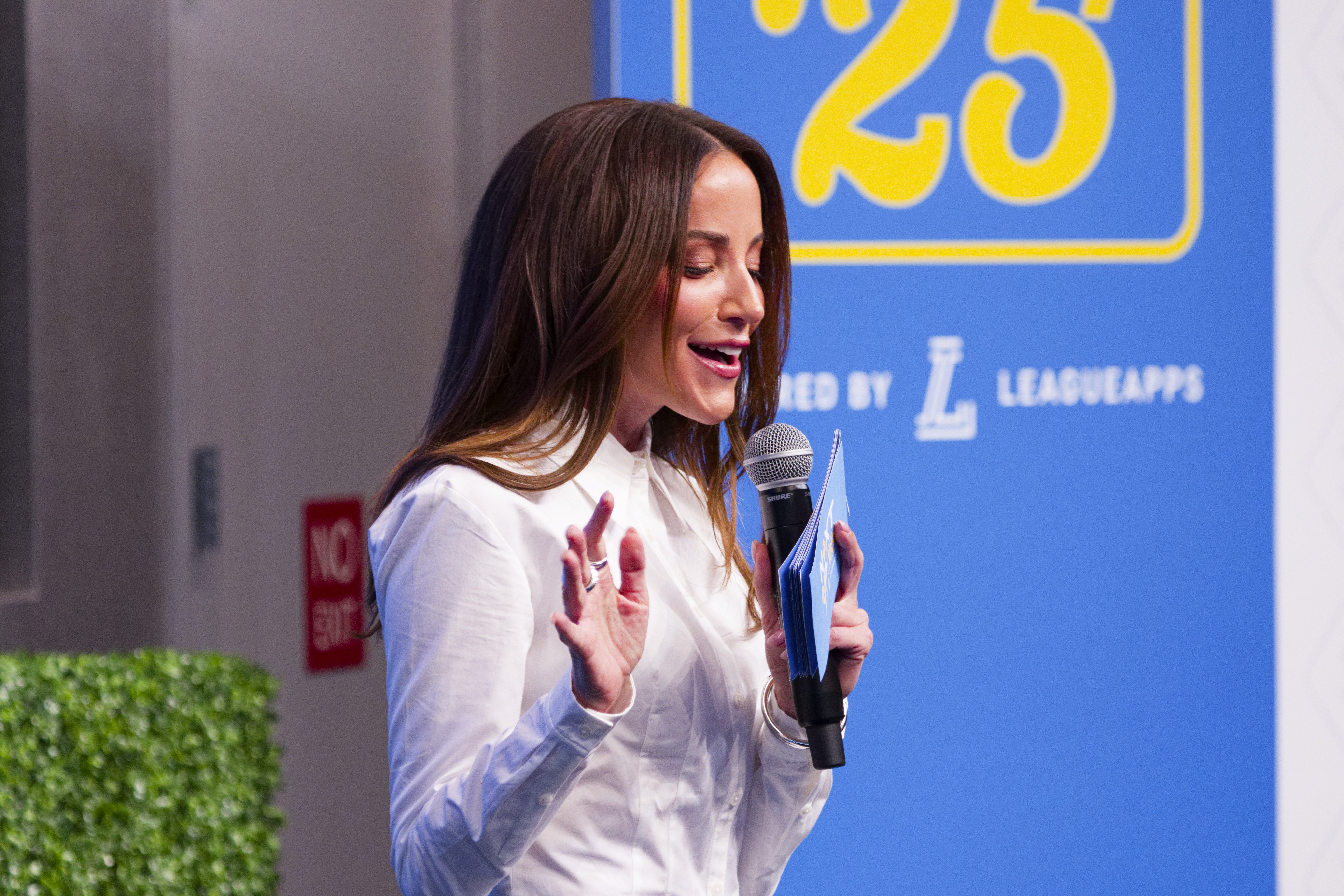
Brand elements carried through personal touchpoints, reinforcing the identity throughout the attendee experience.
Brand elements carried through personal touchpoints, reinforcing the identity throughout the attendee experience.
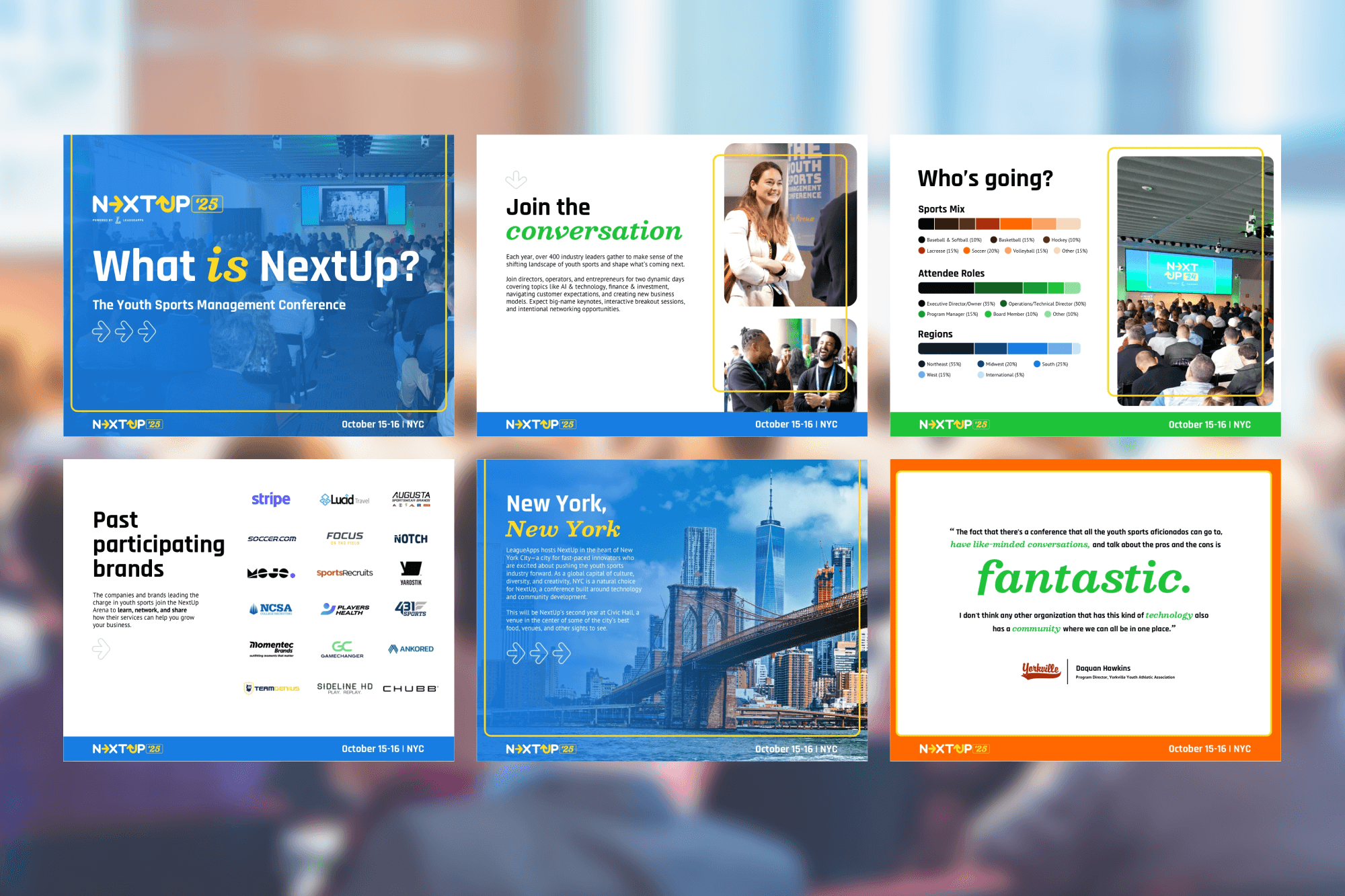
This overview deck gave the sales team a clear, on-brand way to present the conference to partners and sponsors. The design system made it easy to update content while maintaining consistency across pages and use cases.
This overview deck gave the sales team a clear, on-brand way to present the conference to partners and sponsors. The design system made it easy to update content while maintaining consistency across pages and use cases.

The visual system framed key moments, creating a consistent backdrop for speakers and event storytelling.
The visual system framed key moments, creating a consistent backdrop for speakers and event storytelling.

Environmental graphics extended the brand into the space, helping the identity hold up at scale beyond digital.
Environmental graphics extended the brand into the space, helping the identity hold up at scale beyond digital.
Logo animation (made via Adobe After Effects) for use on venue screens and social media content
Logo animation (made via Adobe After Effects) for use on venue screens and social media content