Renzo Gracie Brooklyn
Renzo Gracie Brooklyn
Renzo Gracie Brooklyn

project type
Website Design
my role
Freelance Designer
project overview
Renzo Gracie Brooklyn needed a website that did more than list a phone number and class schedule. I redesigned the site to create a clear, user-friendly destination that helped new visitors understand the gym’s offerings and easily get in touch. The result was a simple, conversion-focused site that gave the owner a more credible online presence and a clear way for prospective students to reach out.
challenge
The existing site had no clear direction and offered very little context about the gym beyond basic contact information. It was difficult for new visitors to understand what the gym offered, what made it different, or how to take the next step. There were also limited resources to work with, including minimal imagery and incomplete or outdated information about programs and offerings. The challenge was to create a clean, effective site experience with what was available, while laying a foundation that could grow over time.
The existing site had no clear direction and offered very little context about the gym beyond basic contact information. It was difficult for new visitors to understand what the gym offered, what made it different, or how to take the next step. There were also limited resources to work with, including minimal imagery and incomplete or outdated information about programs and offerings. The challenge was to create a clean, effective site experience with what was available, while laying a foundation that could grow over time.
The existing site had no clear direction and offered very little context about the gym beyond basic contact information. It was difficult for new visitors to understand what the gym offered, what made it different, or how to take the next step. There were also limited resources to work with, including minimal imagery and incomplete or outdated information about programs and offerings. The challenge was to create a clean, effective site experience with what was available, while laying a foundation that could grow over time.
solution
I focused on a simple, conversion-driven structure built around clear hierarchy, strong calls to action, and SEO-friendly page structure. The goal was to make it easy for first-time visitors to understand the gym’s core offerings and quickly submit their information or get in touch. With limited content and imagery, I leaned into a clean, straightforward layout that prioritized usability over flash. The final site gave the owner a clear destination to send prospective students, and the feedback was positive. The foundation also allows for future expansion, such as adding coach bios and deeper program pages as content becomes available.
I focused on a simple, conversion-driven structure built around clear hierarchy, strong calls to action, and SEO-friendly page structure. The goal was to make it easy for first-time visitors to understand the gym’s core offerings and quickly submit their information or get in touch. With limited content and imagery, I leaned into a clean, straightforward layout that prioritized usability over flash. The final site gave the owner a clear destination to send prospective students, and the feedback was positive. The foundation also allows for future expansion, such as adding coach bios and deeper program pages as content becomes available.
I focused on a simple, conversion-driven structure built around clear hierarchy, strong calls to action, and SEO-friendly page structure. The goal was to make it easy for first-time visitors to understand the gym’s core offerings and quickly submit their information or get in touch. With limited content and imagery, I leaned into a clean, straightforward layout that prioritized usability over flash. The final site gave the owner a clear destination to send prospective students, and the feedback was positive. The foundation also allows for future expansion, such as adding coach bios and deeper program pages as content becomes available.
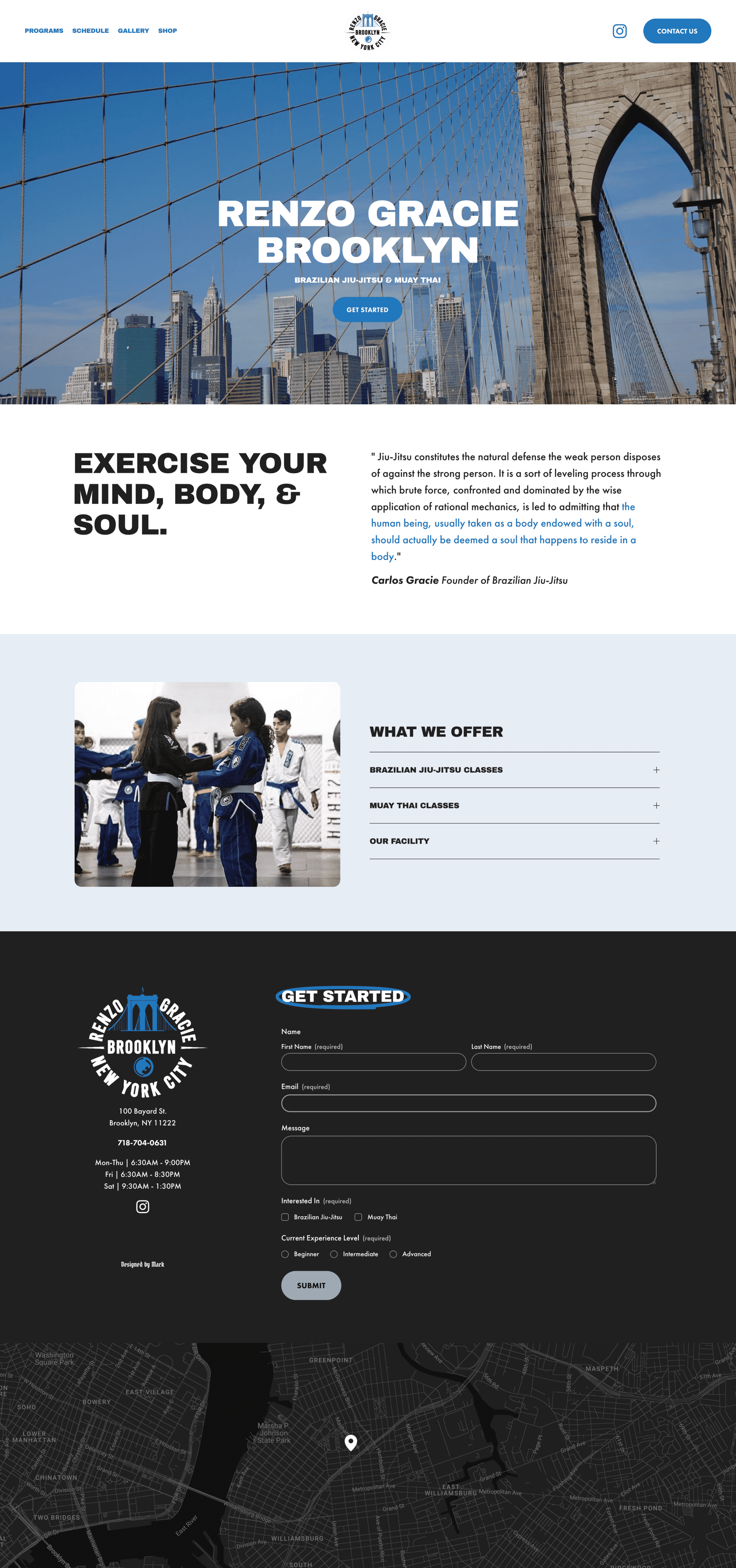
Homepage redesign focused on clarity, SEO, and strong calls to action for easy engagement.
Homepage redesign focused on clarity, SEO, and strong calls to action for easy engagement.

Mobile-optimized info page designed to support SEO and clearly explain Muay Thai offerings for first-time visitors.
Mobile-optimized info page designed to support SEO and clearly explain Muay Thai offerings for first-time visitors.